
logo design // jamie hanley

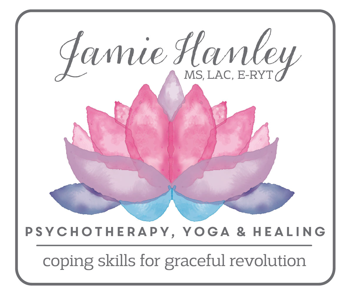
Before my California trip I was working on and finishing up this logo for Jamie Hanley. I find her work, which combines psychotherapy and yoga to heal, fascinating. For her logo, she was very certain about what she wanted; the logo had a "must include list." That list included a lotus flower and that lotus flower had to be watercolor in style. She had also thought about wanting to go an inkblot direction, but once we started working on the design it was clear things could get way too busy if we included a watercolor style and an inkblot aspect to the design.
All of Jamie's must-haves came together as the final logo above and the nitty gritty of the brand is detailed below in the brand guidelines.

a little note: You also get a sneak peak at my new branding on the bottom of Jamie's brand guidelines. I am working on consolidating all of my businesses - freelance design, custom paper goods design, REMEMBER the days, etc. all under one more consolidated roof. It will mean a new website (chloemarty.com) instead of my existing hellotheredesign.com and I think it will just make more sense to have everything under me, as in under my name. I am almost done with the website, but it is kind of a backseat to other projects so I am totally not sure when I will actually finish it and launch it. Anyways, I have started using with clients and you get the sneak peek here!
More posts from chloe marty