
How to use colour... maybe

So here's a pic of our house as it currently stands - the new windows are going in, hurrah! Lots of work still to do, namely the whole back of the house which we (I say we in the loosest sense) can't start work on till we have the planning consent for the extension and a party wall agreement with our neighbours - yawn..zzzz! So what the builders have decided is to get the rest of the house to a finished state and do the back as a separate job. To me this means one thing, I need to decide on paint colours! I have been asked to provide paint for the whole house by next week. Now good paint is expensive and colours are a fickle beast, what looks great in one room will look horribly lurid in another. It's tricky enough choosing colour for just one room in a house, let alone the whole caboodle, and before any of the furniture or art is in, no curtains up etc - everything from scratch! I started off thinking a sophisticated and elegant mix of greys but my colour loving ways soon crept back in and before I knew it every room in the house is going to be a different colour scheme. I've run it through with a few people (namely Nick and my Mum) and neither of them are too aghast at my colour choices but I suppose only time will tell!
Below are a series of inspiration shots which have got me thinking about different colour schemes. Our house may be a way away from looking like an interiors photo shoot but it's good to aim high (even if the reality will surely be something more prosaic!)

In the back sitting room, which is a dark room, I've plumped for a dark blue with green above the picture rail. My inspiration was mainly these gorgeous shots for the new Farrow and Ball blue range. We are not actually going to us F&B, but the paint colours are gorgeous and the styling is brilliant. Obviously they are pros at colour matching but I find the way they put together unusual colours really inspiring.

We are having black floorboards through out the ground floor (apart from the kitchen) and I was a bit worried that they might look a tad oppressive. I love white ones but from my experience they get tatty and scuffed pretty quickly, so black/grey it is. I did a bit of Pinterest research and I actually think that black floor boards work well with both dark and light walls, as long as the ceiling is light, otherwise it feels a bit like a dark box!

The kitchen is going to be a relatively tame affair, looking out on to the garden I want it to mimic nature a little bit. I'm also taking the colour scheme from a lovely old botany print of a hazelnut which we will hang in there. Thus the colour scheme is going to be browns, blacks, greens and off whites. I love the way a line has been drawn around the room in the images above, making the room two separate colours. I think I'm going to steal this idea and have a line around the kitchen with a dark charcoal/chocolate colour below and an off white above, with accents of green (plus the downstairs loo is going to be green).

We don't know yet whether we are having a little boy or little girl (my hunch is a girl FYI) so decorating the nursery is a dicey business. On that note I have plumped for some serious colour clashing. I am on a bit of a pastel drive and I think the mix of colours in the above left image by Farrow and Ball is amazing and totally gender neutral. The image on the left is a more grown up room, that of stylist Ombline de Kersabiec, taken from www.designsponge.com.


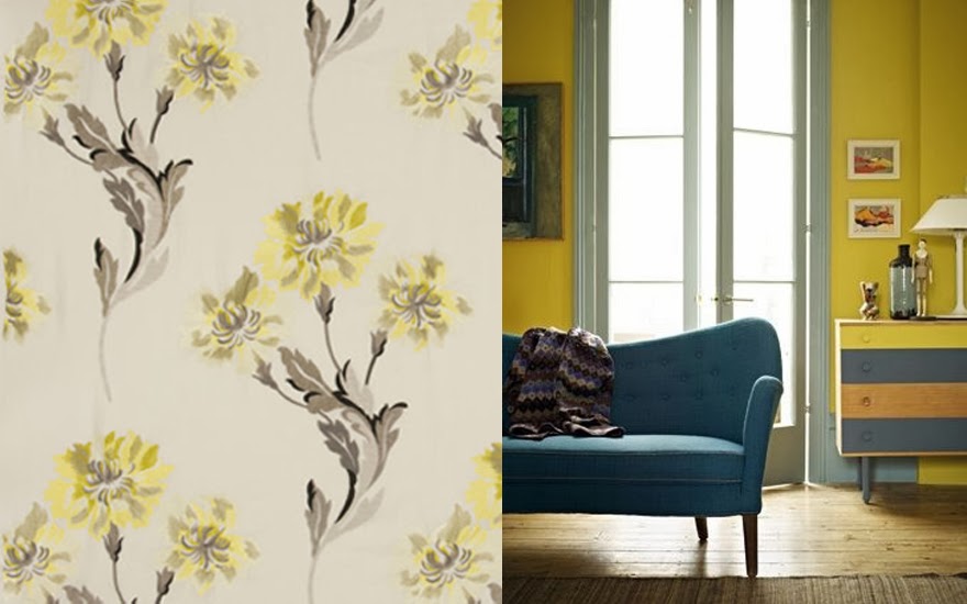
Other than that, we've decided to go for a yellow/grey theme in our front sunny bedroom - this is mainly to match some lovely curtains we already have and want to use (floral pic). I'm a bit nervous about the yellow paint I bought, it's the exact same yellow as the paint in the room above, Hustle at 5pm by Fired Earth, maybe a bit bright for a bedroom and I'm sure I read somewhere that yellow causes arguments, mmm. The floorboards are going to be white upstairs, so over all it will be a very light space as the front of the house faces south.
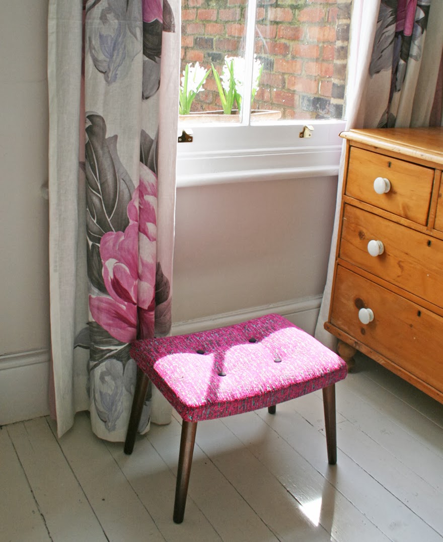
Lastly, the back bedroom is going to be pink. I'm actually just recreating the bedroom in our previous flat as the curtains are gorgeous and I really liked that room. I managed to get some light pink paint and I thought maybe dark aubergine wood work?!


In an effort to save some money but not compromise on quality we bought all our paint from the Fired Earth factory shop where they are selling off any paint in pots with their old branding at a 75% discount. There was a relatively limited choice with all the white colours having been snapped up long ago - I'm just hoping that my love of a bargain has not led us down a rather garish path I might regret later. Given that we got over £1500 worth of paint (at RRP) for just £250, I think I can afford to admit I've made a mistake and by some Dulux if any of it looks too awful!

Here's how I spent last Saturday, knee deep, literally, in paint pots somewhere in Oxfordshire.
I can't wait to get some actual pictures of the house rather than just inspirational shots, until then I will just have to cross my fingers about the paint I've chosen!
More posts from Mary Pedder