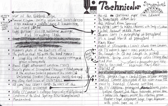
technicolor
Now I've been combining my aesthetic catalogs with my diary, because it was too hard to carry around a million (or two) books at once and then it's like double the nostalgia and I'll feel really accomplished and complete when I look back and have these cohesive memories and maybe it'll be interesting how the aesthetics end up aligning with whatever diary stuff I am writing about at the time. Wooooo.
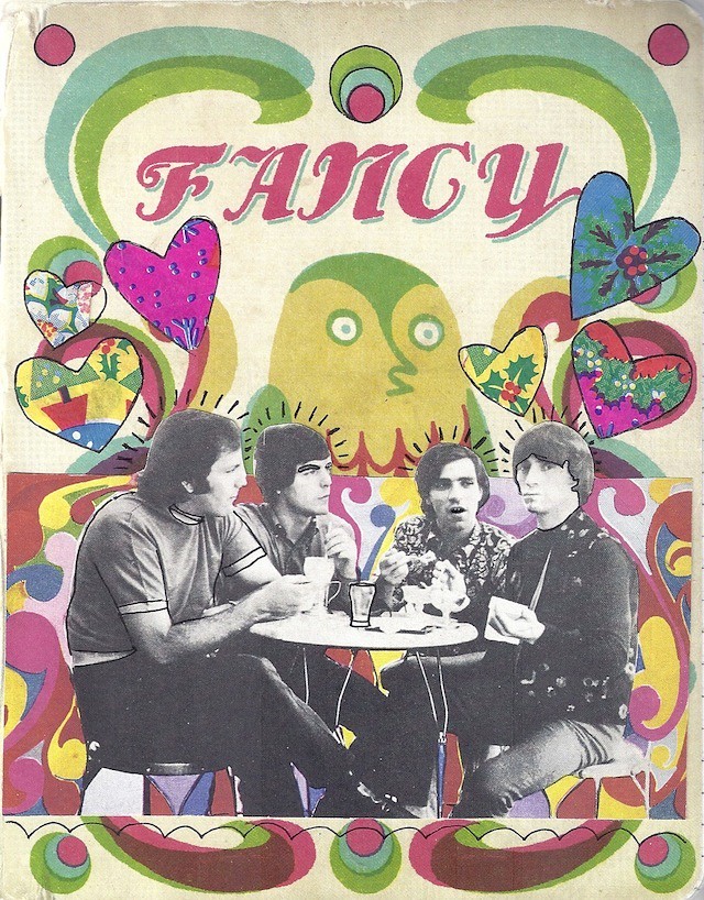
Spencer gave me this journal for my Bat Mitzvah. The guys on it are the Young Rascals, because I got that book Five Hundred 45s but I never look at it so I cut out all the album art I want to hang on my walls or use for collaging. The hearts and back are from old wrapping paper from my pal Edward of Meadham Kirchhoff, and the words are from the Young Rascals, too.


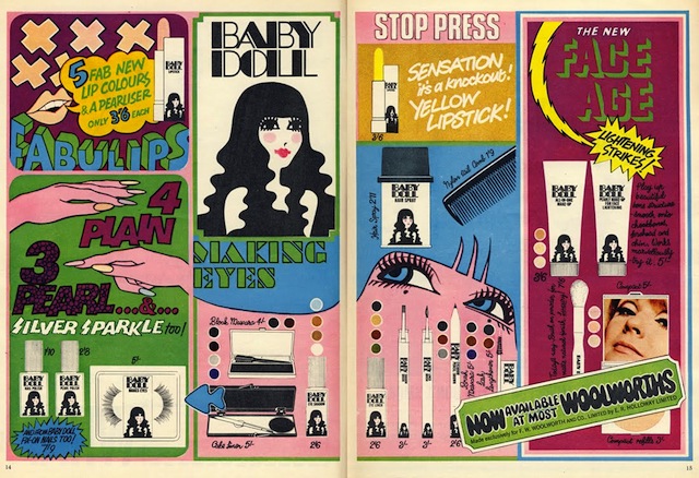
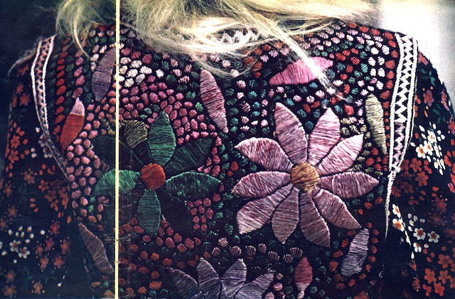
I don't have much to write because this one doesn't have a narrative or concept or anything the way some others I've talked about recently have, just a bunch of images and colors that make sense together in my brain:


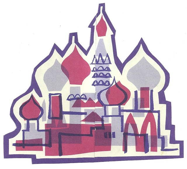
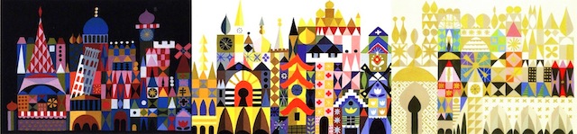
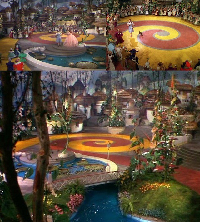
Mary Blair is probably the most important here. She worked at Disney through the '40s-'70s, developing characters and coloring movies like Peter Pan, Cinderella, Alice in Wonderland, Fantasia, and Dumbo. She wore differently tinted glasses every day because she enjoyed the colors, and her nickname at the office was Marijuana Blair. She also designed It's a Small World at Disneyland, which is SUPER IMPORTANT:


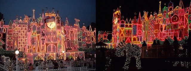
I just like Disneyland because it feels frozen in time. Everything is so specific to how it originally was, so even the Churro carts are pretty...

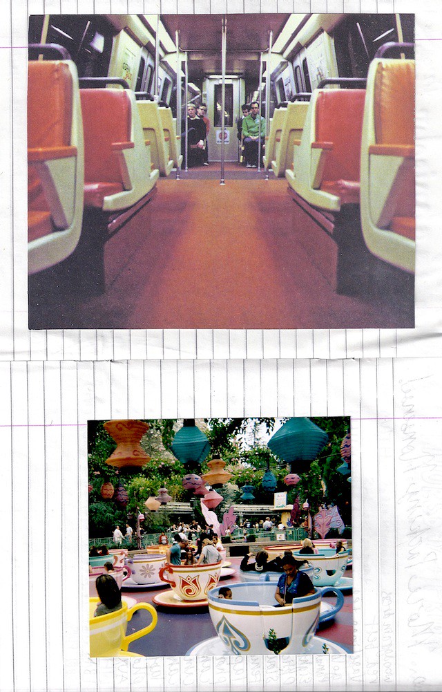
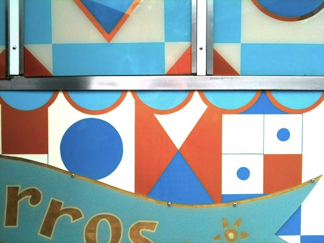
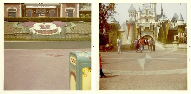
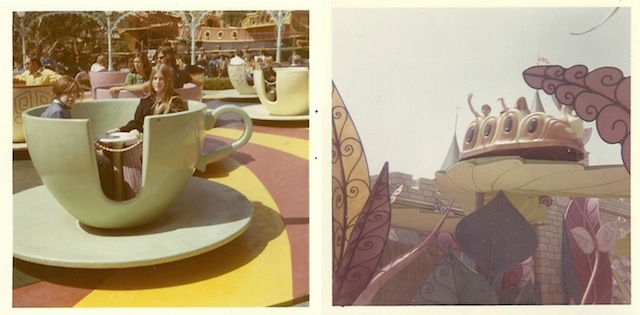
I loved these pictures Spencer's mom let us post on Rookie of her trip there and to Universal Studios in the late '60s and early '70s. When I went a few months ago the trash can in the photo below, on the left, had the same design. See what I mean? I'd just like to force everyone who goes into dressing like Little Bo Peep and then it will finally be the creepy pastel churro utopia I've always dreamed of.


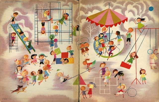
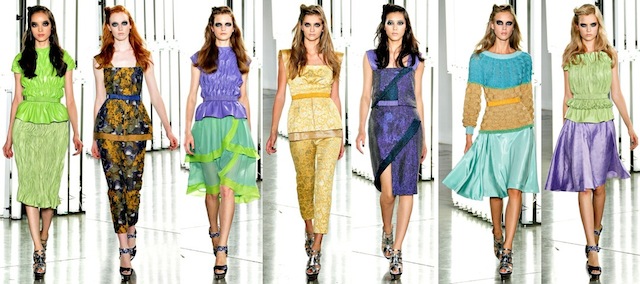
Rodarte's Spring 2012 collection was inspired by the rich glowy coloring in old Disney movies, so there must've been a lot of Mary Blair in that inspiration, too. Which then got them to Vincent van Gogh, who used similar colors. The whole thing is a VISUAL DELIGHT.


My French teacher's room, which I was weird and took pictures of during study hall, matches all this.


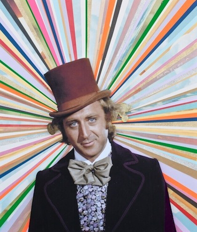
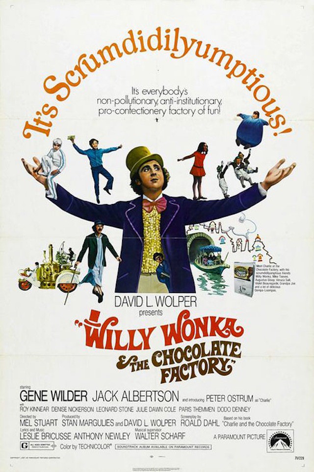
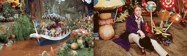
Kelly O'Connor's collages of It's a Small World, old Disney, and Willy Wonka. The blue and orange diamond one perfectly matches the Churros cart from Disneyland above!


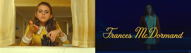
Suzy's entire essence, Frances McDormand's '60s printed dresses, and the font from Moonrise Kingdom


My red saddle shoes, a gift from Rachel Antonoff, and this vintage dress of mine mentioned on the notebook page as "my dress I wore to make churros with Emily & Siobhan." CHURROS ARE SO GOOD YOU GUYS.

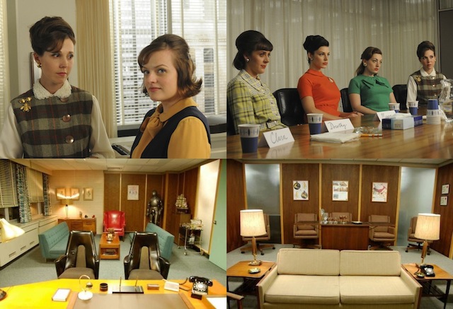
Mad Men


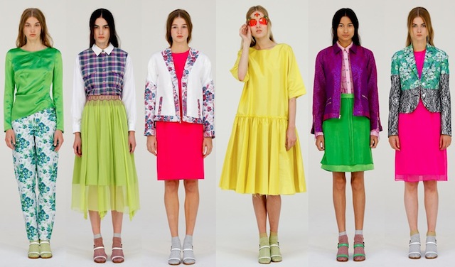
Colors and prints and shoe/sock situation and slightly prim deal going on with Creatures of the Wind Spring 2012


Flight attendant uniforms of the '70s
And here's the snippet from my interview with Daniel Clowes that I wrote about on that notebook page way up above:
And here's the snippet from my interview with Daniel Clowes that I wrote about on that notebook page way up above:
What was influential to you growing up, visually?
Just the whole world. As a kid I loved the look of the early ’60s, kind of the pre-hippie era, just the haircuts and clothes and the way women dressed, it was really appealing. And then all of a sudden people started wearing, like, filthy clothes and messy hair and stuff. That seemed really hideous and horrible to me. It definitely relates to what was going on in my life at the time because, as with many kids who grew up then, my family was just disintegrating while all that stuff came in, so it represented this chaos that was entering my life. But I still have an affection for that pre-1968 look, that kind of saturated Technicolor look. That seems like the real world to me, or like the way things should be.
More posts from