"The Hair" submissions

Hi girls!
So fun to see your contributions! I've picked some of my favorites, and I'm gonna allow myself to comment them too... I hope you don't mind!
I made my photo (top) in a small hurry and didn't really surprise myself with the result. But, I do like the shiny-ness I got in the hair. Or rather, in the hair-helmet.

Lauren McGlynn
I chose this one first because I think Lauren did a great job with light and color. I do think it's a little annoying that the hair goes over her upper lip (it would be more harmonic a bit lower) but composition isn't always as important as color and light! Make sure the skin on your model isn't magenta! That's so important for the right mood and balance. And I think the skin is very good here and the sun flare is just soft enough.
I chose this one first because I think Lauren did a great job with light and color. I do think it's a little annoying that the hair goes over her upper lip (it would be more harmonic a bit lower) but composition isn't always as important as color and light! Make sure the skin on your model isn't magenta! That's so important for the right mood and balance. And I think the skin is very good here and the sun flare is just soft enough.

Tanja Lundin
Great depth in this one! And I like how the girl looks like a precious fruit. Since she has such a kind face the lipstick really works for the photo. I also like the matte calm colors. No magenta in the skin tone :) If I could comment anything it would be that perhaps the brightness in the top left corner steals a little attention for her face, but it's toned down already so it isn't a biggie.

Iris van Vliet
If the last girl was like a fruit, this girl is like a lion. I like the fierceness in her gaze, and I appreciate the drawings on the face.
If I could give any tips, it might be to matte it down a bit. To put some sort of blue or reddish color in the blacks of the picture. So that the contrasts aren't so hard.

Signe Fuglesteg Luksengard (tumblr)
This one is from my homegirl Signe. She's always doing something unexpected nowadays. I've always liked how she mixes red and purple tones, I've seen it before in some of her photos. I thought this was an interesting way to solve the task. Fun to really focus on only the structure of the hair. Maybe it would have been great to see these three sets with three different hair types and with a tad more clarity in the actual hair :)

Gemma Driessen
Gemma also focused a bit more on the actual hair. I thought it was really cute how she made it as water and placed a little paper boat in it. I think the photo could have had some darker colors and maybe a little less contrast. It's a great idea to keep working with!
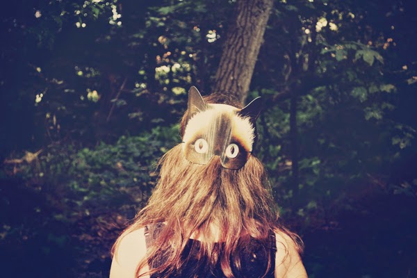

Isabeau
This photo is funny and sweet. I love using masks :)
I appreciate a direct flash combined with warm tones. It's simple and real somehow. And I also like that the dark areas is tinted blue and not pitch black.
Hot tip from Uli would be not to have a tree behind the head. It will always look like you've got a tree-hat on. But once you've learned this lesson, you often never do the same mistake again. That's how it was for me anyways.

Humle Rosenqvist
I think the photographers name goes so well together with the picture. I don't know if this is a self-portrait, but the girl sure looks like a Humle Rosenqvist (what a pretty name).
I like how it's so bright and sad. It feels like a girl from a Jane Austen book. Worried she'll never find a husband. The little bow in the hair does so much to ad to the mood. Without it the picture would loose it's vintage touch. If I would edit it I'd remove some of the red tones in the skin and maybe made her even brighter.
(If my readers don't know how to edit red tones, a quick way is to mask the face (ad some feather) - go to "selective color" - choose red - drag down the magenta. Sometimes doing this in the yellow channel can also help.)

Marie Nielsen
Sweet and simple. The fabric of the dress works great with the lines of the door. I would have loved if the model was more symmetrical to the door though, I think that would have made it more peaceful :)