
Spring Petals
The delicate shades of spring are some of my favorite.
Here are three pale springtime colors that I think are nearly dupes. Two I haven't blogged before, one is a franken that I just love.
Note: all are three coats, no top coat and all are over Nail Tech Ridge filler.
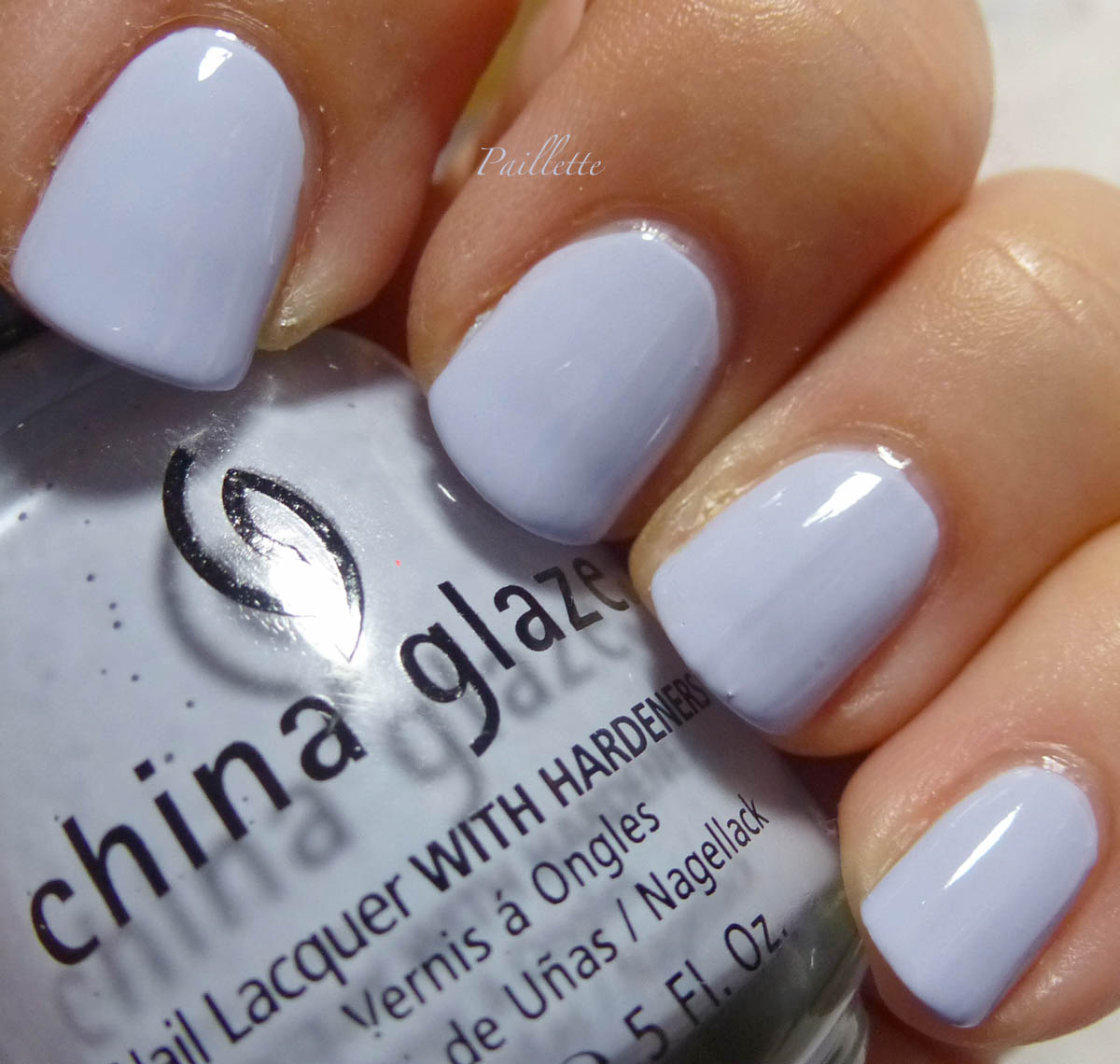
China Glaze Agent Lavender

Do a search and you will see 100 different versions. It is a changing under most light. Looking gray then purple then blue in as many seconds as it took you to read that phrase.
Not on the China Glaze roster any more for some reason.
Maybe it's the weird play on Agent Orange (read up on mid century war, in SE Asia), but it's not really just a weird reference, it's from a China Glaze collection that is from 2008 and called Operation Color, which is a reference to the DC Comix and Marvel Comix action heroes and is supposed to evoke the comic book shades. (Please don't school me on comix, I was only a die hard Archie fan, back before the art went completely to SH!T. I don't know much about the action comix at all. Superman and Batman were as much as I paid attention. I was too busy trying to figure out Betty and Veronica's outfits and why Jughead never paid for a meal)
Meanwhile, for a time, this was a really go to shade of pale periwinkle with a purple tint. My photo is somewhat dusty, and it's a bit of a more clear shade, although so very pale.
I found mine to be a bit uneven, but not bad. The formula for China Glaze isn't overall my most favorite, which is ironic, I cut my teeth in nail polish longing for MANY a China Glaze collection. Now I rarely buy more than a few Halloween, Holiday or other random polishes.
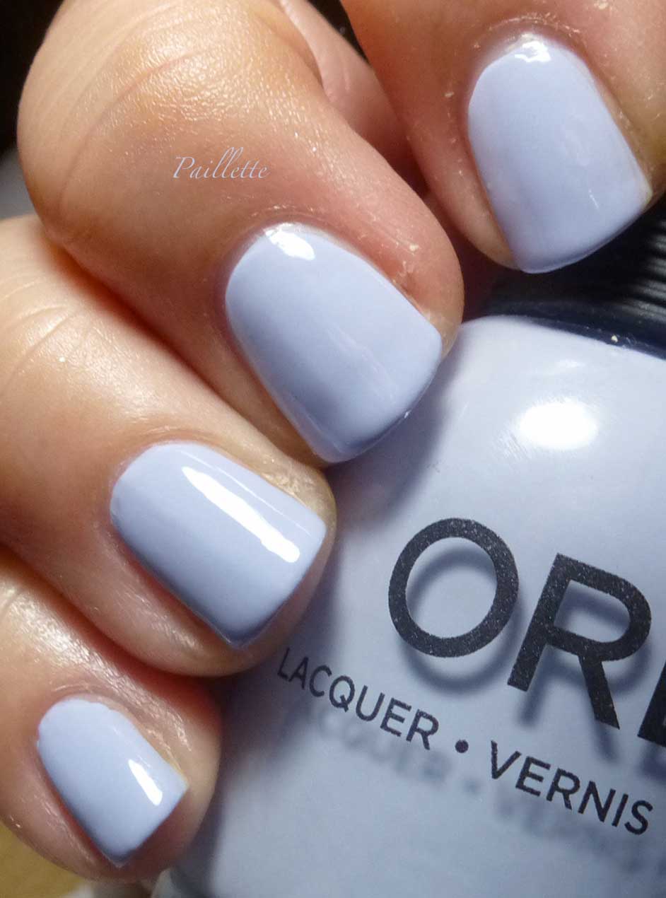
Orly Harmonious Mess

Another that does that presto change-o depending on the temperature of the light. Love this formula, shines at the finish like China Glaze. Less gray than my photo. Was part of Orly's Mash Up collection awhile back. I think anything could have fit into that collection, it was really just a name thing. This is so perfect for spring.
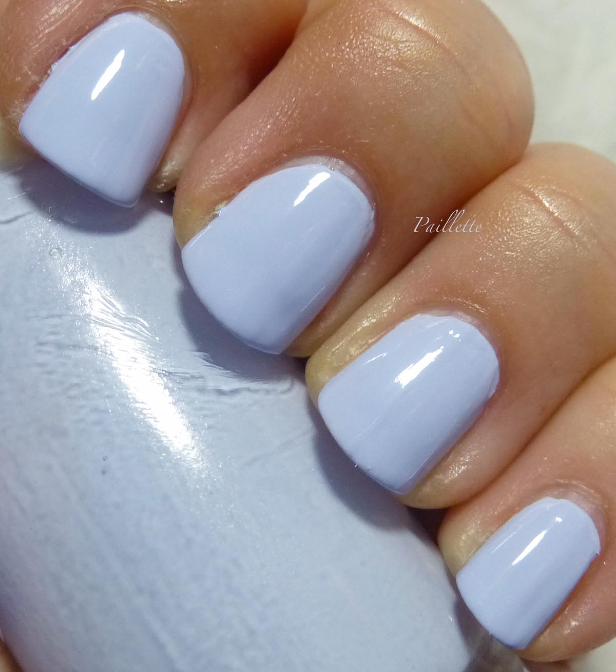
Franken, Refranken

This franken started out as a gray, blogged here.
Then became a pale lavender, blogged here.
Of the three, I think it has a fresher, cleaner look.
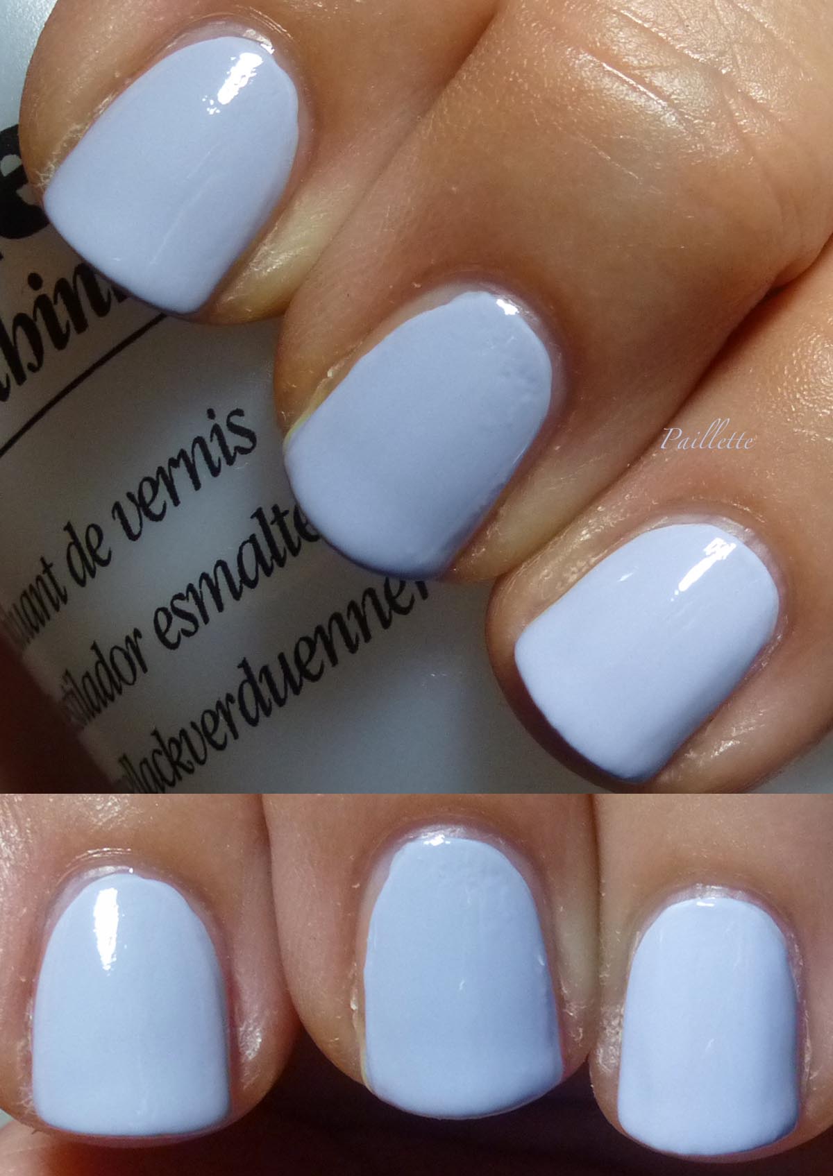
Here is a comparison, that about sums it up better than my earlier photos. Delicate and beautiful.
The comparison shots really just seemed to come out with the right tint and hue of these polishes.

Although they do look blue, they do, well, look blue, but there is a hint of lavender. More like pastel periwinkle.
I like them all, I think that the Orly is the most intense, but they are all very pretty.
Thanks for reading my little nail polish journal!
More posts from Johanna Zamora