
REVIEW & SWATCHES: Urban Decay Vice 3 Palette

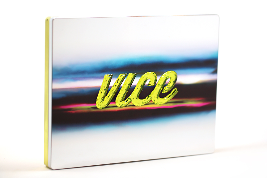
When I opened up my mail and saw this year's Urban Decay Vice 3 Palette (which I didn't even know was going to be made....eee!) my heart gave a little flutter and I actually squealed out loud. Check out this beaut'! The reflective cover, ocean-sunset streaks, and chartreuse crystallized lettering looked very promising. Would this palette live up to the exceptional Vice's past? Let's take a gander below!

Like last year's Vice 2, Vice 3 has a clamshell-style case with a full-sized mirror on top. It also comes with a matching dual-ended synthetic eyeshadow brush. The packaging is jaw-droppingly beautiful but be forewarned that it also attracts fingerprints like WOAH.

There are 20 buttery shadows in this collection which mostly run warm. The thing that immediately stood out to me was just how many red-toned shadows there are here which I personally think is beautiful for Fall but may be intimidating for those with fairer skintones. There's also a good range of neutrals and a few mattes to blend and balance out the several bright, shimmery shades.

And now it's swatchin' time! Since there are so many, I've broken them down into groups of 5 for easy viewing. You can also click on each shade to see an individual color in all its magnified glory.


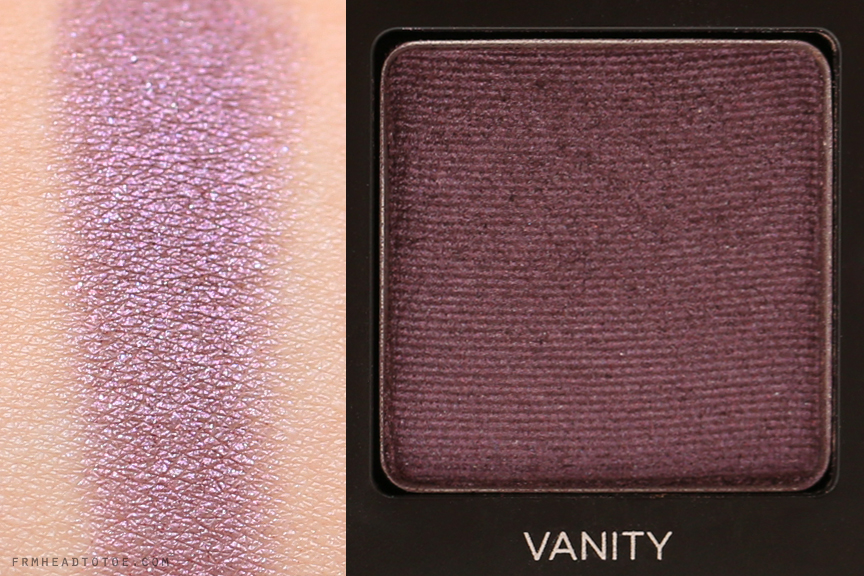
This group has basic shades with green and purple, two colors that I consider to be easiest to pull off for color newbies. I was particularly impressed with the emerald Dragon from this lineup. The reflective quality really popped when applied on the skin.


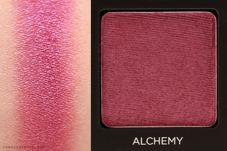
Group 2 reminds me of the ocean sunset that is reflected in the packaging. Warm blue, gold, and burgundy really shines here.


This set is my favorite row for fall colors. The shades here are smoky, sexy, and beautifully pigmented. Downfall is especially perfect for a blending shade on my skintone. Also, how cool is Defy? It's that smooth, mushroomy grey-brown that I always go gaga for. Bondage is also a standout burgundy with incredible depth.


The last row again has the sunset theme with gold, red, and blue. Bobby Dazzle is a beautiful shimmery white that works as an excellent inner corner highlight and Brokedown also really caught my eye with a gorgeous bronzy-gold. Really pigmented colors here.

Something I've observed about this entire palette is that the colors are themed in columns. There is a column of mattes, cool shades, rich shades, reds, and neutrals. Overall I love the quality of shadows in this collection and although the individual color stories in the palette didn't wow me upon first impression like past Vices, I do think it's a very wearable everyday palette.
Ultimately it comes down to shade preference. If you are a fan of reds, blues, and neutrals you will be particularly giddy with this offering. I like that the available colors gives me motivation to push the boundaries of my daily neutral looks by incorporating reds and blues (which I don't do usually) and they do look lovely on the eyes as well as in swatches. I don't think this will be everyones favorite Vice but those who are into the colors presented will be very satisfied with the quality and richness of Vice 3.
Vice 3 is limited edition and available now for $60 from Sephora, Macys, and more recently Nordstrom is carrying the full Urban Decay lineup now as well which is exciting news for Nordies enthusiasts like me! ;)
Readers, what do you look for in a mega palette? Will you be picking up Vice 3? Let me know in the comments!
More posts from Jen Chae