
Burning Bright


If you asked me, I’d never say I was someone who aims to be bright – to fill life with colour, or dabble in especially zany fabrics. But look at my wardrobe, and quickly you’ll see the clash of pinks, yellows, greens, blues and oranges, with plenty of stripes, patterns and prints thrown in among them. An ample dose of subtler background shades too, but they tend to be less noticeable. My necklaces are all jeweled tones and magpie-glitter, while my gloves range from raspberry to mint to lemon (and plenty that can’t be described with references to food either).
For I actually do love colour, especially when it’s mixed together: the satisfaction of a yellow vintage shirt under a blue boiled wool tunic; a baby pink gingham fitted dress with a bright green sixties coat on top; the delicious combination of mauve velvet and teal silk; red mohair facing off a grey leather full fifties skirt; orange pleats matched with khaki layers. Whether there’s a number of juxtapositions, or one shade standing proud against a muted palette, I feel comfortable when my get-up is a little eye-catching.
Plenty of my favourite film sequences and photographers tend to focus on colour too. Consider Kay Thompson with her instructions to ‘think pink’ in Funny Face, Moira Shearer looking glorious in a spray of petrol blue layers and flashes of lavender in The Red Shoes, Marilyn Monroe and Jane Russell dripping with red sequins in Gentlemen Prefer Blondes, or Audrey Hepburn’s array of dresses in orange, lime and light pink in Paris When it Sizzles – and that’s before we get to the technicolour brilliance/ headache of The Wizard of Oz. Also, think quickly of Erwin Blumenfeld, Horst, Irving Penn, Richard Avedon, Tim Walker, Nick Knight. All adept at monochrome, but dazzling in colour too.
But to reign it back in to the personal, it's easy to forget that it’s more unusual to love the vibrant and lively - and that for some a uniform of dark, restrained colours is much more desirable. I often think about this when I’m on the Tube - as I have been a lot this week - where the usual tone of coats, jumpers and trousers errs towards the darker end of the spectrum. Not always, by any means. But to be intensely colourful remains a way of making the choice to stand out slightly. As I try to stay upright, one hand gripping the rail and the other balancing a book, I’m aware that my red lipstick, turquoise cardigan, velvet shorts and purple tights (a combination that works, I promise) marks me apart. I appreciatively note others who’ve also chosen to be bright and bold, as well as the odd man or woman who looks intensely chic regardless of the need for something vaguely flamboyant.
My own choices change from outfit to outfit too. One maxim I frivolously work by is ‘the greyer the day, the more intensely colourful my clothes.’ If it’s drizzling, out come the florals or electric blue beanie hats. (Also, the chillier it is, the shorter the skirt - but we’ll save that for another time). At other points I’ll move towards muted tones, reveling in charcoal, black, brown and navy. Also, uni taught me to dress for comfort, then provided another valuable lesson too – the art of sometimes dressing down, colour-wise. Right now I have on a black leather mini-skirt, black brogues, and a blue and white jumper. Still ‘dressed up’ by some people’s standards, but a little more low-key for me.
I like being able to chop and change though, to move between peacock and pigeon – knowing that I feel equally comfortable in either guise.
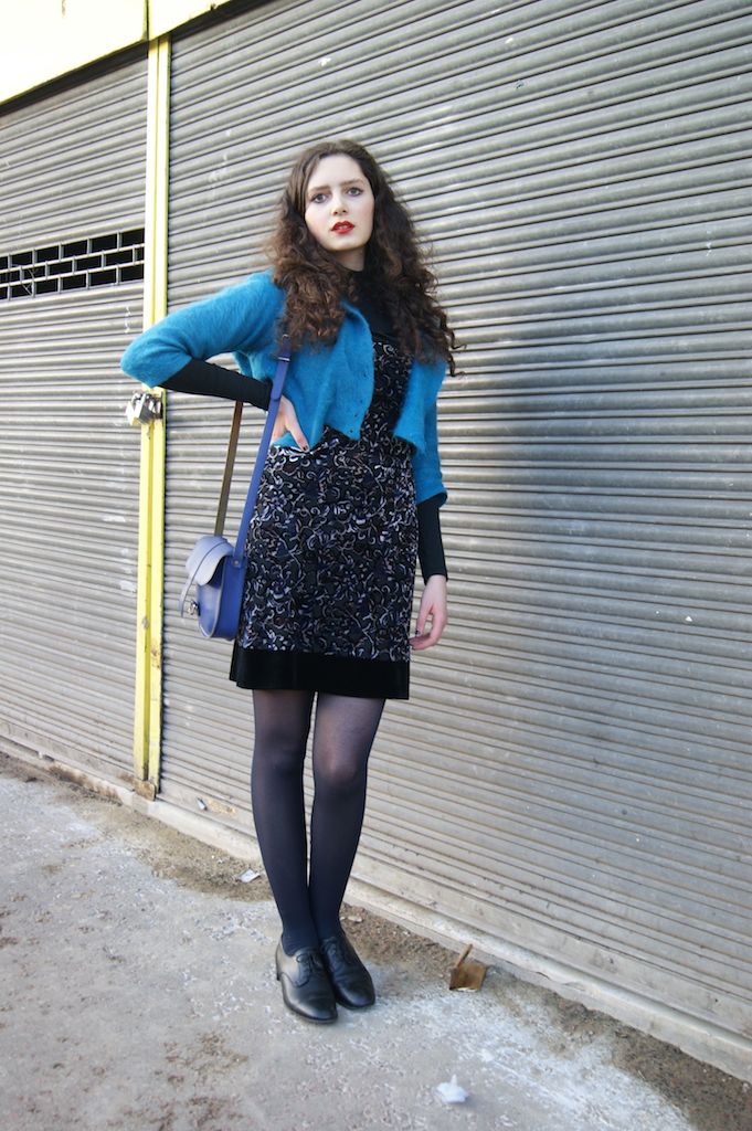
Here we have a mix of the intensely bright and the slightly more muted, thanks to my great-grandma's cardigan, and a velvet dress from a charity shop (with the requisite polo neck underneath) - plus a second hand handbag and men's shoes. Thanks to Stella for snapping the pictures.
More posts from Rosalind Jana