
eight shades of gray (paint).

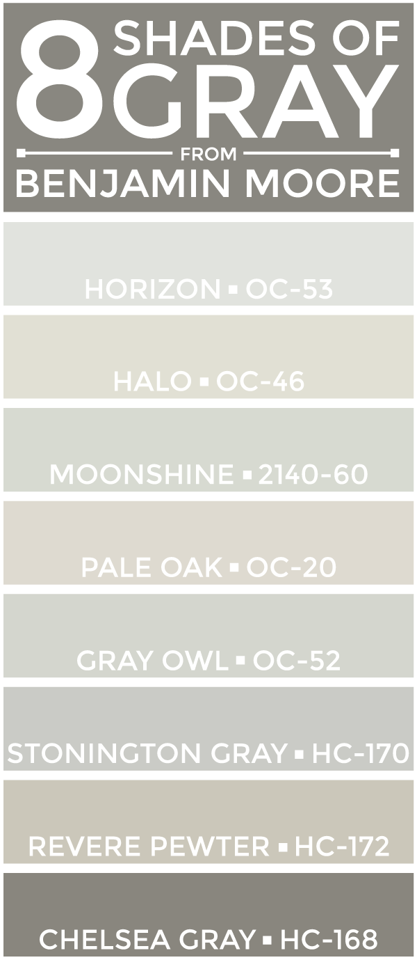
SEE THEM HERE: Horizon (OC-53) | Halo (OC-46) | Moonshine (2140-60) | Pale Oak (OC-20) Gray Owl (OC-52) | Stonington Gray (HC-170) | Revere Pewter (HC-172) | Chelsea Gray (HC-168)
A few weeks back, I asked for your advice on choosing the right paint for your home. Your responses were incredibly thoughtful and insightful. Not only did your input guide the decisions we made, it allowed me to maintain some shred of sanity in the final days of our build. Though we didn't go with an entirely gray color palette for the #bartonbuild, it is definitely prevalent throughout our home. I tested these hues in every room and also did a side-by-side comparison (which I tried and failed to capture with my iPhone). After a ton of deliberation, these are the colors we chose for the aforementioned spaces:
Open-Concept Kitchen, Living Room Foyer: Benjamin Moore Revere Pewter (HC-172) Since this space spans two floors, we needed something that would pop against our trim and this hue did the trick. In person, Revere Pewter shows tan in some lights and gray in others. We were pleased with how it warmed up our home -- without making it too dark.
Guest Bedroom Office: Benjamin Moore Gray Owl (OC-52) These two rooms receive the first light in the morning. We went with Gray Owl for these spaces because it is a touch 'cooler' than some of the other grays we tried.
Nursery Spare Bedroom: Benjamin Moore Stonington Gray (HC-170) If I'm being honest, we chose Stonington Gray for the nursery because it best matched the swatch for glider we chose. I kept it going in the other (mirrored) bedroom because the glider might one day move to that room. It is also slightly 'warmer; than Gray Owl in person.
Master Bedroom: Benjamin Moore Horizon (OC-53) Not to be confused with Horizon Gray (2141-50), Horizon was a last-minute addition to my sample options. Since we have a deep gray headboard (almost like the Chelsea Gray seen above), we didn't want anything too dark. Using our fabric swatch as a guide, we agreed this was a light enough hue without being a boring choice.
Master Bathroom: Benjamin Moore Gray Owl (OC-52) Our master bathroom is outfitted with some beautiful marble. Even in the absence of windows, the Carrara tile just popped next to Gray Owl.
The extras: The other bathrooms, mudroom, laundry room and master closet add a bit of color -- and another paint distributor -- to the mix. (I'll share those in another post soon!)
Though it may look like it, this post was not sponsored by Benjamin Moore. I simply liked a few of their colors better and invested the majority of my research on their color families. I learned a lot about paint stores in this process. The biggest takeaway? Any paint store can use another distributor's color numbers as guides to create the paint. It may not be exact, but it comes out close. If you're worried about precision, it is best to trust that particular brand's experts.
I loved nearly every shade of gray we tested, but some had to win. As always, this post isn't one-sided. If you have other grays you love which I missed, be sure to share them in the comments below. Thank you again for all of your wonderful insight in this process -- I can't wait to share some photos with the paint in action! xoxo {av}
