How to Turn the Shape of a Letter or Word into Script in Silhouette studio
I'm not going to go so far as to say I'm a stalker...but I might be a keen observer and it seems to me that some Silhouette crafters want to know how to turn the shape of a letter or a word into script! I, for example, turned the lyrics of my wedding song into the shape of my monogram. I mean...how cool is that?!

I am not even exaggerating when I tell you I've been working on finding an answer to this one for weeks. This is a fairly complex tutorial and one I would consider advanced so hang on for the ride because I promise, you'll LOVE the end result!
I should also point out this is not one of those cut and dry Silhouette tutorials that's going to work exactly the same for everyone - a lot of it has to do with the fonts you pick, their sizing, and the length of the phrases or words you chose. Due to the complexity (don't be scared, I'm breaking it all down for you) I'm sharing both a written tutorial with pictures and a video to demo this.
First I'm going to show you how to create one of these designs with a full word...and then the single letter will be easy peasy! Now in the words of my 4 year old...let's get started!
If there's one thing I've learned about designing these in Silhouette Studio it's that single line text is essential. In other words you need to get yourself a sketch font. I actually combined two sketch fonts for this first example. Sketch fonts are crucial for the base font - that's what I'm calling the text that's used for the shaped word - because they make single line characters rather than an outline like regular fonts do in Silhouette Studio.
Ideally you want to pick a font that doesn't have too many loops because they end up hard to read as the text passes over itself...and they make this already tricky designing even more tricky!
Start by typing out your base word. I used rr Beautiful Dreamer - Sketch font from the Silhouette Design Store. I've said it before and I'll stress it again - I don't buy a lot of designs from the store, but I will spend $2.99 on a sketch font because it's super useful - in tons of Sil applications.

Now make the font size really large.
You know that to curve you need to put it on a circle. Well, to curve text into a letter, you need to make that letter a shape and you do that by converting that letter to a path (aka shape). To do that right click > convert to path. Now your text is no longer treated as text, but as a shape and the edges are treated as a path. If necessary, you may need to enlarge your design even further...for instance Love is almost 11 x 6" in my example.


Next, type out the quote or phrase or verse that you want to take the shape of the base word.
A few tips:
- If you are going to sketch your design, go with a thin sketch font. I used 'Georgia Peach Sketch' - also from the Silhouette Design Store.
- If you are planning on cutting your design on vinyl or htv I would suggest you NOT use a sketch font. Thin non-script font like MrMustache work the best, but with some character spacing adjustments you can also use thin script fonts as I did with the pillow.
Replicate the line a few times so you have a couple of copies to work with. For now, keep these lines of text as text, do not convert them to paths.

Now double click the first line of text you have until you get the green box. Grab that little directional arrow looking thing and drag it onto the first letter. If you need to adjust the font size or the character spacing do that now. I wanted the whole line to fit on the first letter and when I found the perfect size and spacing for that I used those settings for the rest of the text as well even if it meant splitting up lines of text on other letters.
If you are going to cut on vinyl or HTV use the character spacing bar to add space between your letters (You need the extra space because you will eventually add a small offset around each letter and you don't want your letters getting muddled together.)

At this point you can right click the first line of text and convert to path. This will basically freeze the line in the shape of the L. You can also delete the L (now gray, indicating a path) since you no longer need the path. See how when I move the phrase off the L it stays? That's because it's been converted to a path, or shape, and now it's no longer treated as text either - but instead a shape.

Repeat the process for the remaining letters - and don't be afraid to get creative (and don't forget to convert them to paths)!! You can see I used edit points (double click the letter to get the points) to slightly modify the curve of the O. I also stretched it sideways slightly to prevent too much overlap and to allow the full line to circle around the O while still being read-able.
If your text snaps to the wrong side of the path (say the inner and you want the outer) move it away from the letter and try again. Use the little directional arrow to adjust the positioning of the along the path.

Don't be afraid to break up your lines of text, either. For example, with the V, I actually only used part of the phrase and let it pick up on the e. I had to create those two boxes of text separately, keep in mind.
I also extended the tail of the e, by stretching the edit points (double click the letter to get them), so that I could end at the end of a sentence.
I also extended the tail of the e, by stretching the edit points (double click the letter to get them), so that I could end at the end of a sentence.

Here's a direct comparison of the original font (top), the modified path to fit my smaller text (middle) and how it looks with the text lines - note the differences in the shapes of the o and e.

This design I sketched with a Silhouette sketch pen onto a card. You can also use it as a print and cut or thicken the font and cut it. I will be sharing this Love design as this week's Freebie Friday cut file so be sure to check back on Friday to grab it!

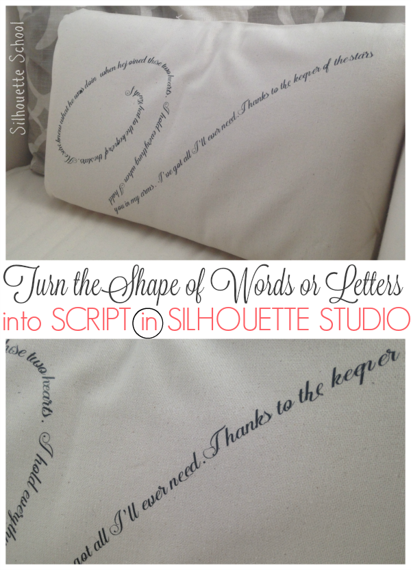
Now lets look at the pillow...it was done the same way with just a single monogram.
As I mentioned, if you are cutting on HTV or vinyl and you opted for a thin font, you likely need to go need to go one step further: Select the entire design > offset > .015 apply. Delete the original text and cut the offset.
That's the route I went to make this htv design for a pillow..and as you can see I only used a single letter monogram rather than a full word for the shape.


Both methods are further explained in this quick video if you'd prefer to watch than read and to pick up a few more tips.

Note: This post may contain affiliate links. By clicking on them and purchasing products through my links, I receive a small commission. That's what helps fund Silhouette School so I can keep buying new Silhouette-related products to show you how to get the most out of your machine!
Thanks for coming to class today at Silhouette School. If you like what you see, I'd love for you to pin it!


Get Silhouette School lessons delivered to your email inbox! Select Once Daily or Weekly. Subscribe Here!

More posts from